"Maybe it’s something in the gazpacho or paella, as Spain just surpassed Italy to become the world’s healthiest country."
Get Started for FREE
Sign up with Facebook Sign up with X
I don't have a Facebook or a X account


 Your new post is loading...
 Your new post is loading...
Your new post is loading...
"Maybe it’s something in the gazpacho or paella, as Spain just surpassed Italy to become the world’s healthiest country." 

Renee's curator insight,
May 14, 2019 5:45 AM
This data will be helpful for students to exam how where a person lives influences their wellbeing (health with a focus on two Asian countries, as per curriculum descriptors). This can be a starting point for learner investigations of; reasons for, and consequences of, spatial variations in human wellbeing on a regional scale within India or another country of the Asia region (ACHGK079 - Scootle )
Sign up to comment

"While the Korean War of the early 1950s never formally ended, its aftermath has created starkly divergent worlds for those living on either side of the north-south divide. What follows is a look at life in the two Koreas; how such a night-and-day difference came to be; and where the crisis could go from here. Both governments claimed to be the legitimate rulers of the peninsula. Tensions between north and south gradually mounted, until finally, in June 1950, hundreds of thousands of North Korean troops stormed across the 38th parallel. The unsuspecting South Korean defenders were outgunned and outnumbered, and beat a hasty retreat southward."

Stevie-Rae Wood's curator insight,
December 9, 2018 9:10 PM
The two Koreas are polar opposites literally, North and South. The Korean war that took place some 68 years ago never formally ended because they could not come to peace agreements. So the border between North and South Korea known as the DMZ is the most heavily fortified border in the world because tensions still run high. The DMZ is the cease fire line. Both sides fear invasion, however in the current state of things it seems as if the North is more aggressive towards invasion that the South, as the South has found some secret tunnels and fear there's more by the North Koreans. Economically the North is severely behind in the world because of there dictators. While the South has become an economic Tiger thanks to the UN and USA trying to promote democracy in the area.

Matt Danielson's curator insight,
December 12, 2018 3:51 PM
The two Koreas are a great example of how Capitalism, Democracy, and liberty are far better than Communism. Just the difference in light visible from satellites at night in the two countries speaks volumes. The war being technically not over and only under cease-fire always leaves that chance for the conflict to reopen. Though today they are taking major steps toward peace and making moves that have never been done before. The amount of famine and overall sub quality of life in North Korea is mind blowing, and with much of it kept secret its hard to imagine how bad it really is.

Kelvis Hernandez's curator insight,
December 14, 2018 3:54 PM
For the two Korean nations, there are stark contrasts in the standard of living and wealth of the people. While the Korean war began in the 1950's it never formally ended a ceasefire was called and has just not flared up in a massive battle again. The two nations are uneasy with each other having different ideas for what Korea should be, but both nations do want a joint Korea. Looking at a map of the energy consumption by the two nations there is a line between those who have it and those who do not. These two have shown solidarity as well in the Olympics joining as one nation, but tensions will continue to flare for a long time.
"The U.S. Census Bureau has designed a multimedia application experience, a story map, called 'Rural America: How Does the U.S. Census Bureau Define Rural?' This story map contains interactive web maps, tables, information, and images to help explain how the Census Bureau defines 'rural.' Many rural communities rely on American Community Survey (ACS) 5-year estimates, rather than ACS 1-year estimates, because of population thresholds. This story map helps data users understand the history and definition of 'rural.' Watch this video and then visit the story map to learn more." Visit the Story Map: http://go.usa.gov/x8yPZ

Matt Manish's curator insight,
February 16, 2018 10:57 PM
The U.S. Census Bureau defines "rural" as an area with less than 50,000 people living in it. The majority of the United States is actually considered rural while a small minority of the country is labeled as urban. But interestingly enough, most rural areas are clustered around urban areas rather than in random locations. It seems as though the further out one ventures out from the center of an urban area like a major city, the more the population begins to decrease. One can also see in the same situation, the area transition from urban to rural. U.S. Census data can tell us a lot about populations in rural and urban areas and the correlation between them which can be important to know for many reasons.

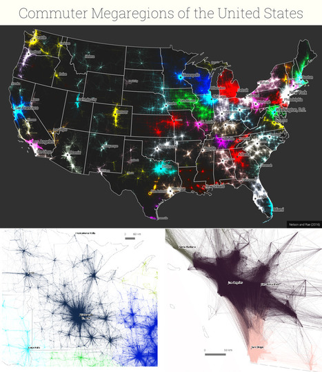
"By extending each region into the 3rd dimension, it’s possible to show the relative importance of each region while retaining the map’s shape, keeping the areas recognizable. In this case, the height of each county corresponds to its total number of votes, though it could just as easily show population or share of the electoral vote. For a closer look, see the full screen interactive version."

PIRatE Lab's curator insight,
December 10, 2016 10:30 AM
Another example is the long line of defining the new geography.

Boris Limpopo's curator insight,
December 11, 2016 1:43 AM
Le macroregioni americane con i dati del pendolarismo

"To design a map of the world is no easy task. Because maps represent the spherical Earth in 2D form, they cannot help but be distorted, which is why Greenland and Antarctica usually look far more gigantic than they really are, while Africa appears vastly smaller than its true size. The AuthaGraph World Map tries to correct these issues, showing the world closer to how it actually is in all its spherical glory."
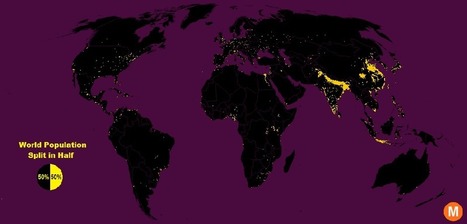
"Data viz extraordinaire Max Galka created this map using NASA’s gridded population data, which counts the global population within each nine-square-mile patch of Earth, instead of within each each district, state, or country border. Out of the 28 million total cells, the ones with a population over 8,000 are colored in yellow."
Tags: population, density, mapping, visualization. Via Brian Weekley

Brian Weekley's curator insight,
July 27, 2016 10:47 AM
Great simple map of world population. Scroll down and look at the U.S. It reflects the global trend. This also has political implications, as evidenced by voting patterns in the 2012 presidential election. Elections are dependent upon votes, which come from people, which are primarily clustered in cities. Election campaigns would use this data to plan their schedules as to where to focus their campaigning efforts. For the folks in Wyoming, they rarely see candidates other than during the primaries. And these world populationclusters have been relatively consistent historically, particularly in south and east Asia. Northern India has serious carrying capacity challenges. Notice the clusters along the Nile- evidence of arable land.
"The 2015 Global Peace Index reveals a divided world, with the most peaceful countries enjoying increasing levels of peace and prosperity, while the least peaceful countries spiral into violence and conflict. Explore the state of world peace on the interactive Global Peace Index map. www.visionofhumanity.org "

The Social Progress Imperative creates a shared language and common goals to align different organizations and achieve greater social impact.

Claire Law's curator insight,
April 25, 2015 8:45 PM
Interactive map showing different categories of social progress 
Raychel Johnson's curator insight,
May 26, 2015 10:34 PM
Summary: This article included an interactive map that was based on the Social Progress Index, which is an organization that measures how developed a country is based on the basic human needs available, access to education and healthcare, and personal rights and choices. The general pattern was that developed countries had higher amounts of these things, while developing countries obviously had less. This is similar, but more refined, than the UN Human Development Index, which measures more than just social factors.
Insight: This model can go hand in hand with the UN Human Development Index, which measures the progress of each country on much more different scales. This has been more refined to social issues, but the same patterns can be seen in both indexes.

"By using Facebook data from the 2.5 million people in New York or New England that ‘like’ either the Red Sox or Yankees I was able to create a more accurate rivalry map than ever before."

Mark Hathaway's curator insight,
September 15, 2015 8:13 AM
This map pretty much met my general expectations for the size of Red Sox's and Yankee Nations. Most of New England is clearly Red Sox Nation. As a Yankee fan living in hostile territory, I was heartened to know that Yankee territory is not all that far away. Connecticut is the true battleground in the fight for more territory. That state serves as the crossroads between New England values and culture, and New York values and culture. I think this map says a lot more about New York and New England than just who supports each baseball team. Sports is often a window into our lives and habits. If you asked me to divide New England from New York, I would probably divide it along these lines. 
Adam Deneault's curator insight,
December 6, 2015 4:53 PM
This is a pretty interesting map, I am unsure though if using Facebook is actually an accurate tool of determination for the Yankees and Red Sox borders, but I guess it is alright if someone is just trying to figure out a general idea of what fans live where in the North East. As assumed, most of New England was going to be fans of the Red Sox, and as the more west you went toward NY, that it would change to the Yankees. Clearly though, after looking through the article, Connecticut is where the battle hits hardest, Eastern Conn likes the Red Sox, Western Conn likes the Yankees, with a mix toward the middle. What I find quite interesting though is the map of the Mass/NY line how it shows instantly a diving line between the two teams without crossing borders. 
Corey Rogers's curator insight,
December 14, 2018 12:58 AM
Usually when you think Red Sox vs. Yankees, you think New York vs. New England but it is more diverse than that. You can find Yankee fans deep inside of "Red Sox territory" and the same thing goes for Yankee fans as well. It is too tough to draw a specific line for who is a fan for each team. Just need to leave it open for cross region fans and just enjoy the rivalry.

The Urban Observatory city comparison app enables you to explore the living fabric of great cities by browsing a variety of cities and themes.

Utiya Chusna Sitapraptiwi's curator insight,
July 15, 2013 5:44 AM
Easy to find a picture of the city in the world. 
Matthew DiLuglio's curator insight,
October 12, 2013 5:45 PM
I have been using Google Earth to check out a few different areas that I have and have not been to, particularly Washington D.C./Maryland, which I visited last month for the first time. I thought it was truly awesome and loved all the subtle differences as well as the larger and more obvious differences from RI. This Observatory is pretty interesting, and doesn't limit your observations to strictly visual perceptions, unlike most Astrological Observatories. It is a compendium of knowledge, information, and facts that define and characterize, categorize and redefine areas of the world. This seems like something out of Minority Report or Deja Vu (two really good sci-fi movies with visual observation technology that looks through time), both because of its appearance, and because of its general function. It also reminds me of some stuff that I've seen in the 1967 "The Prisoner" series, which really blew my mind about sociological portayals of the occasionally subversive human condition from entirely oppressing parties and circumstances. Hopefully this information will, as comes with great power, be treated with great responsibility... For all our sakes. |
"The U.S. Census Bureau has designed a multimedia application experience, a story map, called 'Rural America: How Does the U.S. Census Bureau Define Rural?' This story map contains interactive web maps, tables, information, and images to help explain how the Census Bureau defines 'rural.' Many rural communities rely on American Community Survey (ACS) 5-year estimates, rather than ACS 1-year estimates, because of population thresholds. This story map helps data users understand the history and definition of 'rural.' Watch this video and then visit the story map to learn more." Visit the Story Map: http://go.usa.gov/x8yPZ Via Michael Miller
Matt Manish's curator insight,
February 16, 2018 10:57 PM
The U.S. Census Bureau defines "rural" as an area with less than 50,000 people living in it. The majority of the United States is actually considered rural while a small minority of the country is labeled as urban. But interestingly enough, most rural areas are clustered around urban areas rather than in random locations. It seems as though the further out one ventures out from the center of an urban area like a major city, the more the population begins to decrease. One can also see in the same situation, the area transition from urban to rural. U.S. Census data can tell us a lot about populations in rural and urban areas and the correlation between them which can be important to know for many reasons.

"Play this interactive game--move the 15 red countries to their appropriate locations to turn the countries green. If you give up, you can double click on a red country to locate it (but it will turn blue)."

Ivan Ius's curator insight,
February 16, 2018 9:22 AM
Geographic Thinking Concepts: Spatial Significance; Patterns and Trends
Matt Manish's curator insight,
February 16, 2018 7:18 PM
This is an interesting quiz to test your world geography skills. It gives you the shape of a country in red and you have to place the shape on the correct country. If you can't find the correct country, just double tap the shape and it will show you which country it belongs to. This was definitely a challenge for me since I only got two of the countries correct. I found particular difficulty with locating the smaller countries with less features that stand out. Although I only got two answers right, I did enjoy this map quiz because it helped me to realize that I should brush up on my world geography skills more to help me stay informed with what's going on in the world.
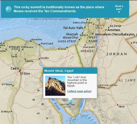
Although these were designed specifically for GIS day during Geography Awareness Week, these 2 excellent map-based treasure hunts from ESRI are great any time of year. The answer to the question will only pop up in you are zoomed in the the right region (SHIFT + Make a box = Zoom to area). These links will take you to the World Cities quiz and also to the Mountains quiz. Via Seth Dixon

Seth Dixon's curator insight,
January 18, 2018 6:54 PM
I love this geography, map-based quiz that let's people explore the world as they learn about some interesting places. 
Douglas Vance's curator insight,
January 18, 2018 7:00 PM
This is a brand new and to me, a unique way of exploring global geography by using trivia questions as a means to explore the world. 
Kami Romeike's curator insight,
April 8, 2018 5:29 PM
I love this geography, map-based quiz that let's people explore the world as they learn about some interesting places.
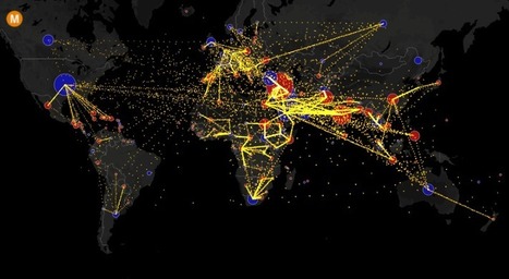
Visualizing the flow of the world's migrants from country to country.
Based on data from the U.N. Population Division, this map shows the estimated net migration (inflows minus outflows) by origin and destination country between 2010 and 2015. Blue circles = positive net migration (more inflows). Red circles = negative net migration (more outflows). Each yellow dot represents 1,000 people. Hover over a circle to see that country’s total net migration between 2010 and 2015. Click a circle to view only the migration flows in and out of that country. For more info about this map, read the article, All the World’s Immigration Visualized in 1 Map.
Tags: migration, USA, mapping, population, unit 2 population.

GTANSW & ACT's curator insight,
December 17, 2016 11:46 PM
Migration at a global scale changes places
Syllabus Students investigate reasons for and effects of internal migration in Australia and another country, for example:
Students investigate the reasons for and effects of international migration to Australia, for example:
Geoworld 9 NSW 8.1 Migration: people own the move 8.2 Australia: destination nation 8.3 Where do immigrants settle 8.4 Culturally diverse australia: trends in migration
8.8 Australians are mobile people 8.9 Mobile indigenous populations 8.19 Lifestyle migration 8.11 The power of resources: the Pilbara 8.12 Migration changes the USA Geothink
It took 200,000 years for our human population to reach 1 billion—and only 200 years to reach 7 billion. But growth has begun slowing, as women have fewer babies on average. When will our global population peak? And how can we minimize our impact on Earth’s resources, even as we approach 11 billion?

Jordyn Reeves's curator insight,
January 11, 2017 3:44 PM
This relates to our topic by showing that our population is growing rapidly. By the time 2025 there will be more than 11 billion people on the Earth. But we have enough resources to last us.

"No borders. No landmarks. No context. How many countries will you be able to recognize? Here’s how this works. I give you a the outline of several countries together, without borders or any other context, and you guess which countries you’re looking at."
Every 10 years, the Census Bureau calculates the exact center of the US population. Here's what that statistic shows about our history.

"The map above shows the most prevalent race in each county, based on data from the 2013 American Community Survey 5-year estimates. Select and deselect to make various comparisons."
Tags: cartography, mapping, visualization, census, ethnicity, race.

Seth Forman's curator insight,
May 26, 2015 6:47 PM
Summary: This map shows racial distribution throughout Baltimore.
Insight: This article is relevant to unit 7 because it shows how a city has been planned and built over time around racial discrimination with areas of similar race clumped together. 
Quentin Sylvester's curator insight,
May 27, 2015 12:17 AM
This census map shows the diversity of America, but also largely shows how entire counties, such as those around Baltimore and St. Louis can be seemingly segregated between races, though all persons are American. This leads to bizarre nationalism and continued ethnic and racial divides in society through the uneven distribution of race and ethnicity in the US. 
Sameer Mohamed's curator insight,
May 27, 2015 9:00 AM
I think it is interesting to think about the reasons where certain ethnic groups live. It is sad but also interesting to see that because of the slavery in the south, black americans make a large if not dominant percentage of the majority of the south. It is also interesting to see where Asian Americans living where they do because it is a newer migration pattern. This is reflected in the areas that Asians settle because of how they got to their homes.

Google Earth Engine works with scientists by using satellite imagery to provide data visualizations for environmental and health issues.

Todd Hallsten's comment,
February 13, 2015 10:39 PM
I like the idea of this map because it allows for the comparison of logged forest to preserved forest. Allowing for facts not rumored amount of trees producing air, i would really like to see a map of alaska..

"22 Maps That Show How Americans Speak English Totally Differently From Each Other"

Lena Minassian's curator insight,
January 27, 2015 5:58 PM
This article was actually funny and interesting. You do not really pay attention to the pronunciation of words just because we are surrounded by the same people who say a particular word the same way. Many individuals in the US are in for a culture shock if they leave their respected homes. One word that you have grown up with may be a completely different word in another area. We tend to not focus a lot of attention on the smaller details like this type of grammar and pronunciation so this caught my eye because it was interesting to think about and realize how you say words compared to the rest of the United States. 
Louis Mazza's curator insight,
January 28, 2015 11:53 AM
to me this is not so shocking but definitely entertaining. i mean between my family their is pronunciation differences. some say tomato others say toma`to right? not all English is the same is a concept that makes perfect sense to me. in other countries such as Italy, a person from the north cannot understand a person from the south because they speak in different dialects. perhaps it has to their with their location, or job types. but it holds true that different parts of a country can speak the same language in different ways. 
Kevin Cournoyer's curator insight,
April 8, 2015 3:04 PM
I've seen this collection of maps a number of times before, but they are just as interesting and informative every time I look at them. It's really a fun exercise in seeing what phrases you use or how you pronounce certain words as opposed to the rest of the country. As a Rhode Islander, the bubbler/water fountain divide was of particular interest to me. I also found it funny that I have the vaguely Western/Midwestern tendency of calling "rotaries" (or what are traditionally called rotaries in my area), "roundabouts". This is especially curious to me, because I generally tend to think of that term as a British one. Could this possibly mean that a lot of British immigrants settled in the Western/Midwestern United States? Or am I just mistaken and buying into a poorly informed stereotype about British people?
Whatever the case, these maps are very informative and say a lot about the linguistic differences that occur even within one country. Now granted, the United States is a large country, so there is bound to be a good amount of variation. But it's still fascinating to me just how much variety there can be. The fact that when traveling, your use or pronunciation of a certain word or phrase can immediately identify you as an out-of-towner is very interesting. This is yet another example of the importance of doing your own research in order to avoid making incorrect assumptions. Just because all of the people within a geographic border may live in the same country, it does not mean that their dialects or colloquialisms are all the same. It does not even necessarily mean that they speak the same language. Different immigrant groups (because almost no country is impervious to immigration) settle in different areas and this ends up contributing (in part) to the different dialects and expressions that one finds within geographic borders. |