


"Don’t listen to the gloom-sayers. The world has improved by every measure of human flourishing over the past two centuries, and the progress continues, writes Steven Pinker."
Get Started for FREE
Sign up with Facebook Sign up with X
I don't have a Facebook or a X account


 Your new post is loading...
 Your new post is loading...
Your new post is loading...
"Don’t listen to the gloom-sayers. The world has improved by every measure of human flourishing over the past two centuries, and the progress continues, writes Steven Pinker." 

dustin colprit's curator insight,
December 10, 2018 9:35 AM
It is important for more information providing facts supporting how the world is in fact becoming more enlightened. In today's current society a lot of people gather information from social media and other information outlets that are not always accurate. But their research will often stop here and they will already form an opinion. I think moving away from this and getting more accurate information to people would help the progress of enlightenment.
Sign up to comment
Every 10 years, the Census Bureau calculates the exact center of the US population. Here's what that statistic shows about our history.
"The reason why some countries are rich and others poor depends on the quality of their institutions, the culture they have, the natural resources they find and what latitude they're on."
Tags: development, statistics, economic, globalization, poverty.

Kaitlyn Evans's comment,
July 30, 2015 5:24 AM
I'm not sure if I believe everything this video stated, however I think it is a good topic to analyze. I think it would be interesting to see how the rich countries became rich. They can't just have started on top. I also believe the rich countries abuse the poor countries because we can get goods/minerals/just about anything for a small price and then sell it in the rich country for much more.

Adrian Bahan (MNPS)'s curator insight,
March 14, 2016 7:49 PM
I can't say I agree with all the arguments put forward in this video, it can still be a nice starting point to get students to critically analyze the ideas put forth and assess the merits of the claims being made.

Republicans and Democrats are more divided along ideological lines – and partisan antipathy is deeper and more extensive – than at any point in recent history. And these trends manifest themselves in myriad ways, both in politics and in everyday life.
A decade ago, the public was less ideologically consistent than it is today. In 2004, only about one-in-ten Americans were uniformly liberal or conservative across most values. Today, the share who are ideologically consistent has doubled: 21% express either consistently liberal or conservative opinions across a range of issues – the size and scope of government, the environment, foreign policy and many others.
Tags: political, statistics, regions, USA.

Luis Cesar Nunes's curator insight,
March 31, 2015 7:57 AM
The right-wing ideology is worldwide, years of racist colonial acculturation, sexist and neoliberal social inequality. The culture industry was filled to disclose these conceptions. 
Eden Eaves's curator insight,
May 24, 2015 8:14 PM
Unit 6 A decade ago, the public was less ideologically consistent than it is today. In 2004, only about one-in-ten Americans were uniformly liberal or conservative across most values. Today, the share who are ideologically consistent has doubled: 21% express either consistently liberal or conservative opinions across a range of issues – the size and scope of government, the environment, foreign policy and many others. 
Chris Costa's curator insight,
September 16, 2015 9:49 AM
Bipartisanship is at an all-time low in this nation's history, which is evident in every facet of our political system; our Congress for the past 10 years has been the most inactive it has been since the 1890's. Party members on both sides of the debate have refused to compromise, leaving many Americans frustrated. The polarization of the parties has been the primary driver of this divide, with ideological and social issues now at the forefront of any political debate, in the place of economic, foreign, and other domestic policies. With this ideological element now added to politics, we see much more aggression in terms of how Americans on either end of the political spectrum now view the other end. Although this is great in the sense that many young Americans are becoming more interested in and more involved with politics, it also leads to incorrect, fragmented views that demonize the opposing party. Americans are finding a shrinking amount of political issues to compromise on, and until we learn to do so, Congress will remain in a gridlock.
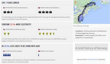
"MyLifeElsewhere allows you to compare your home country with different countries around the world. Ever wonder what your life would be like if you were born somewhere else?"

HG Académie de Rennes's curator insight,
January 31, 2015 1:56 AM
Un site d'une grande simplicité d'utilisation bien qu'en anglais. Le principe est de choisir deux pays dans un menu déroulant pour en comparer les principaux indicateurs de développement sous la forme de petites infographies très pédagogiques. Dernière information sur ce site, les statistiques utilisées proviennent des bases de données open source de la CIA américaine. 
Brian Wilk's curator insight,
February 7, 2015 7:51 PM
After studying this comparison tool and using it to find the best of the best and worst of the worst, I picked out some highlights I'd like to share. Monaco is clearly the place to be born, earn, and live. When compared to the USA, the infant mortality rate is 71% less, the life expectancy is 10 years longer @ 84, and you'll earn 62% more money, no doubt because you have ten more years in which to do so. I believe the stats may be skewed a bit in this country comparison as the very rich live there and they have access to the best medical care, and probably don't have very many infants with them when they make the move from elsewhere, hence the low infant mortality rate. Austria is not a bad second choice as you are 33% less likely to be unemployed. On a sobering note, the life expectancy if you live in Namibia is only 52! Yikes, I'm already 53... It's far worse however in Swaziland. The life expectancy is sadly only 50.5 years and you are 44 times more likely to have AIDS than if you lived here. 26.5% of the population has AIDS! Be thankful for where you live and stop complaining, it's far worse on average in nearly all other countries. 
Monika Fleischmann's curator insight,
February 15, 2015 4:59 AM
Seth Dixon's insight:
Did you know that with 1/30th the territory of the United States, Norway still has over 25% more coastline? I didn't either until I compared Norway to the United States using My Life Elsewhere. This site is designed allow United States students to imagine how their lives might be different if they were born in a different part of the world. Students would probably die 21 years earlier if they were born in Liberia and 11 times more likely to have died in infancy. Students would be 43.8% less likely to grow up and be unemployed and have 36.3% less babies if they were born in Taiwan. This side-by-side format is a great way to help students help make these statistics real and meaningful. One major drawback: this site only allows users to compare a country to the United States. If you prefer to have students compare, say Cuba to the United Arab Emirates, I would recommend that you try If It Where My Home. |

"In the 2016 edition of its World Development Indicators, the World Bank has made a big choice: It’s no longer distinguishing between 'developed' countries and “developing” ones in the presentation of its data. The change marks an evolution in thinking about the geographic distribution of poverty and prosperity. But it sounds less radical when you consider that nobody has ever agreed on a definition for these terms in the first place. The International Monetary Fund says its own distinction between advanced and emerging market economies “is not based on strict criteria, economic or otherwise.” The United Nations doesn’t have an official definition of a developing country, despite slapping the label on 159 nations. And the World Bank itself had previously simply lumped countries in the bottom two-thirds of gross national income (GNI) into the category, but even that comparatively strict cut-off wasn’t very useful."

James Piccolino's curator insight,
February 8, 2018 6:51 AM
I agree that it is important to categorize in order to learn and group things together. I understand some of the implications but it is nonetheless important to the way we learn about other areas. To do away with all labels of this kind will not make the topic and world view more inclusive, but instead make things so complicated that people will either not understand it or not bother with it's complexities. Things need to be distinguished between qualities and traits in order for proper analysis.

othni lindor's curator insight,
October 20, 2018 2:55 AM
This article explains how the World Bank is removing the term "developing country" from its data. This means that developed countries and developing countries all get lumped into one. This can change the way we view some countries compared to others. This can also help remove the stigma people have for certain countries. The downside to this is countries identify themselves differently from other countries and want to be identified as their own country. This can strip the identities of a country if it gets lumped together with another region or as one continent.
"The 2015 Global Peace Index reveals a divided world, with the most peaceful countries enjoying increasing levels of peace and prosperity, while the least peaceful countries spiral into violence and conflict. Explore the state of world peace on the interactive Global Peace Index map. www.visionofhumanity.org "

The Social Progress Imperative creates a shared language and common goals to align different organizations and achieve greater social impact.

Claire Law's curator insight,
April 25, 2015 8:45 PM
Interactive map showing different categories of social progress 
Raychel Johnson's curator insight,
May 26, 2015 10:34 PM
Summary: This article included an interactive map that was based on the Social Progress Index, which is an organization that measures how developed a country is based on the basic human needs available, access to education and healthcare, and personal rights and choices. The general pattern was that developed countries had higher amounts of these things, while developing countries obviously had less. This is similar, but more refined, than the UN Human Development Index, which measures more than just social factors.
Insight: This model can go hand in hand with the UN Human Development Index, which measures the progress of each country on much more different scales. This has been more refined to social issues, but the same patterns can be seen in both indexes.
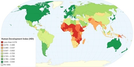
"This map shows Human Development Index (HDI) for 169 countries in the World. The HDI is a comparative measure of life expectancy, literacy, education, and standard of living for countries worldwide. The HDI sets a minimum and a maximum for each dimension, called goalposts, and then shows where each country stands in relation to these goalposts, expressed as a value between 0 and 1, where greater is better. The Human Development Index (HDI) measures the average achievements in a country in three basic dimensions of human development: health, knowledge and standard of living."
Tags: development, statistics, worldwide. Via Jim Lerman

Caroline Ivy's curator insight,
May 18, 2015 10:41 AM
This article discusses the Human Development Index (HDI), what it is, and how it is calculated.
This chart displays that the top three spots on the HDI are occupied by Norway, Australia, and the Netherlands respectively, with the USA coming in fourth. As HDI is calculated by comparing aspects like literacy, standard of living, education, and life expectancy, why are two European countries and Australia in the top 3? Something to be looked at is the in-migration of each country. Immigrants arrival in large numbers in some countries can lower HDI if they are refugees or come from a country with a lower HDI, for they may be illiterate, have a low education, and therefore a low life expectancy. With in migration to the US tightly controlled but in constant motion, their HDI could be pulled down to 4th. As Norway and Australia and the Netherlands are not the main destination for refugees, their HDI could be higher. 
Cody Price's curator insight,
May 27, 2015 12:49 AM
The HDI is the human development index which ranks countries in many different aspects. The higher the country the more developed and modern it is. The least amount of death and the longest lives are here. It is more stable the higher the country.
This relates to the topic in unit 6 of HDI. this map shows the basic HDIS of the world and the patterns formed by the HDI layout of the world. 
Anna Sasaki's curator insight,
May 27, 2015 2:04 AM
This map shows the Human Development Index around the world. The HDI depends on a set list of variables, ranking them from 1st to last. Nations considered to be "Western" are more developed than nations in regions such as Africa and Asia, although all nations are slowly but steadily developing, improving their Human Development Index ranking. The HDI shows development in nations, although leaving out Inequality factors. This map also allows us to see spatially what regions tend to be more developed as well as developing.

"By using Facebook data from the 2.5 million people in New York or New England that ‘like’ either the Red Sox or Yankees I was able to create a more accurate rivalry map than ever before."

Mark Hathaway's curator insight,
September 15, 2015 8:13 AM
This map pretty much met my general expectations for the size of Red Sox's and Yankee Nations. Most of New England is clearly Red Sox Nation. As a Yankee fan living in hostile territory, I was heartened to know that Yankee territory is not all that far away. Connecticut is the true battleground in the fight for more territory. That state serves as the crossroads between New England values and culture, and New York values and culture. I think this map says a lot more about New York and New England than just who supports each baseball team. Sports is often a window into our lives and habits. If you asked me to divide New England from New York, I would probably divide it along these lines. 
Adam Deneault's curator insight,
December 6, 2015 4:53 PM
This is a pretty interesting map, I am unsure though if using Facebook is actually an accurate tool of determination for the Yankees and Red Sox borders, but I guess it is alright if someone is just trying to figure out a general idea of what fans live where in the North East. As assumed, most of New England was going to be fans of the Red Sox, and as the more west you went toward NY, that it would change to the Yankees. Clearly though, after looking through the article, Connecticut is where the battle hits hardest, Eastern Conn likes the Red Sox, Western Conn likes the Yankees, with a mix toward the middle. What I find quite interesting though is the map of the Mass/NY line how it shows instantly a diving line between the two teams without crossing borders. 
Corey Rogers's curator insight,
December 14, 2018 12:58 AM
Usually when you think Red Sox vs. Yankees, you think New York vs. New England but it is more diverse than that. You can find Yankee fans deep inside of "Red Sox territory" and the same thing goes for Yankee fans as well. It is too tough to draw a specific line for who is a fan for each team. Just need to leave it open for cross region fans and just enjoy the rivalry.
|


